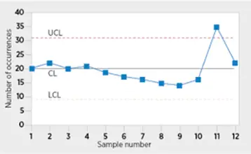
Control charts and run charts have a few things in common, namely monitoring process performance. A control chart is a plot of some statistic (such as the average, R-bar, or range) plotted against time, with upper and lower control limits.
A run chart is a line graph in which the points plotted are observations taken at the same time intervals. You might use a run chart to display sales over time, whereas you might use a control chart to monitor defects per unit. The differences between control charts and run charts may seem simple, but they are significant in terms of what can be observed and how.
People always confuse control charts and run charts. Both are essential quality control tools with varying abilities. This article explains those differences in detail, the pros and cons for each chart, and offers some examples.
What is a Control Chart?
A control chart, also known as a Shewhart chart, is an advanced description of a run chart. It plots one line of data and additionally shows the lower and upper control limits. The lines significantly differentiate between unusual and normal data variations and highlight if the interpretation is negative or positive. There are two types of variations, the special cause and common cause, which can be detected using control charts.
A common cause is where the SPC chart displays the controllable variations. It indicates that the variations can easily be seen and resolved, hence no need to change the system. An example is a seasonal increase in rainfall or sunshine in some months which is a common variation for farmers and is always anticipated.
If an SPC chart indicates a special cause variation, the process is termed unpredictable. Nonetheless, the variance isn’t always a bad thing. Most quality improvements target producing a positive special cause variation. They do this by incorporating changes to a stable system using the plan do study act (PDSA), which keeps new performance processes that advance the process display.
Variation may be due to changes away from the process in which the project manager focuses. For these scenarios, the project manager only needs to identify the causes and work on them and not change the process. He needs to have basic knowledge in statistics to create control charts since the chart incorporates this knowledge.
Elements in a Control Chart
Control charts have essential elements such as mean, control limits, and axes. They majorly rely on the output mean of a process and the standard deviations. The mean and standard deviations help to show if a process is in control or out of control.
The control limits are the upper control limit and lower control limit. They are also determinants of process in management and out of control. In control charts, processes range within the control limits of a control chart.
The horizontal axis(x-axis) represents time, subgroups or units, while the vertical axis (y-axis) represents the value you are interested in and are measuring.
What are Run Charts
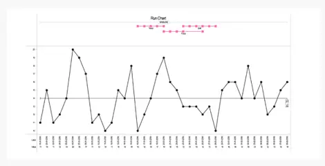
Run charts are straightforward to use and incorporate meaningful information. It is a straight-line chart of data that a person plots over time. They help an organization discover trends and patterns in their project. They are easy to evaluate since they are simple and straightforward, thus gives a clear visual of data. Run charts additionally indicate a particular cause and common cause.
Run charts don’t have control limits hence can’t predict whether a process is stable. But they indicate the manner a process is running. They are significant, especially at the beginning of a project, as they show crucial details concerning a strategy before collecting vital data, which is necessary to create control limits.
Run charts oversee data trends over time and indicate any significant cycles or shifts. They concentrate on crucial changes rather than normal variations and also dictate important details used for forecasting trends.
Run charts additionally pay attention to a measure before implementation and after implementation to know the impact. They are a measure of running record and have the vertical axis, horizontal axis, and centerline. The vertical axis is the process under focus, the horizontal axis is the unit of time corresponding to the measurements, and the center lines are the mean of the measurements.
Elements in a Run Chart
The elements in a run chart include title, axes, data points, legend, median, and data table. The designation demonstrates the details analyzed on the chart while the axes are vertical and horizontal axis. The vertical axis highlights the dimension of the collected data, while the horizontal axis indicates the measured events’ progress.
The data points display each unique measurement, while the legend stands for the meaning of each line and extra information which highlights the data. The centerline or median value indicates a considerable value of consecutive values below or above the line. The data table refers to the list of the data displayed in the chart.
Control Chart vs Run Charts
Control charts significantly use statistical control limits to control the process to reduce variance. Simultaneously, run chats lack this statistical benefit and trying to adjust the process will increase the variation rather than reduce it.
Control charts are more applicable than run charts when it is crucial to indicate the deviations in a process and when a project manager needs to take corrective action rather than terminate the whole process.
Control charts help monitor a process and check if it’s in line with reasonable norms. It also shows the nature of deviation, which allows a project manager to correct the variation, which isn’t possible in run charts.
Examples /Application of Control Chart and Run Charts
Both control and run charts have respective uses, depending on the process a company is running. Run charts are significant in strategies that fit the bill. It is simple and straightforward, thus clearly highlights the state of a process without incorporating unnecessary complications.
In the case where an organization values limit, it is essential to use control charts. They help evaluate the actions a manager needs to take to ensure the process is correct. Control charts are mostly applicable when:
- Controlling an ongoing process by detecting the problem and correct them
- forecasting the expected level of output from a process
- Evaluating whether a process is in statistical control
- Analyzing the form of process errors from the common cause or particular cause
- Assessing whether the quality advancement project should focus on aiding against specific problems
In internal auditing, the organization can implement the control charts to oversee the different auditing processes throughout the year. This because most of the internal auditing processes are recurring, and the primary function of internal auditing is to determine whether the organization adhered to its policies and standards.
The organization incorporates the control charts to oversee the invoice payments, payroll accounting and revenue collection. The payroll accounting procedures are repetitive and entails: valid authorization of overtime, evaluation of gross calculations, payroll and pay deductions and approval of time records.
Example 1
The internal auditors sample each employee’s pay record on every payment they receive. After that, they evaluate and approve each document to ascertain its accuracy. In constructing a control chart for this data, the auditors analyze the various audits for every sample, count them and put them in a graph.
This process’s control chart gives a clear picture of internal control against the payroll procedure for 12 consecutive pay periods. The internal auditor can analyze the data on the control charts and know if the internal controls were adequate.
The points out of control may be due to the unexpected variations in the payroll process and immediate warrant inspection. The possible causes of the points being out of control are where the organization hired more employees or alternating critical responsibilities. In case the variation is from any of these two reasons, the organization needs to educate and train the new employees to avoid this error.
Example 2
Another example is travel and entertainment expense. The company implements the control charts to take care of the expenses and costs. The project manager effectively oversees the expenses by ensuring the organization authorizes the expenses properly and documents them.
The organization has to monitor both the tax and cost. They effectively oversee the expenses by ensuring the authorities correctly document and authorize them. They also put control measures which monitor the range of expenditures effectively.
To easily monitor these expenses, the company can take the number of vouchers per sample and depict it on a control chart. Out of control processes for the company’s fees could be due to hiring of new employees who didn’t have enough experience on proper procedures for handling a travel voucher.
Since the cause is known, the company can correct the variation by directing the new employees on reasonable procedures.
Pros
Both run and control charts are helpful tools for analyzing data.
Control Charts
- They graphically display a company’s data such that the special cause variation readily evident
- It helps determine whether the advancements in a process are effective
- Significantly lower the amount of downstream inspection
- They give an exact performance boundary which is essential in the analysis
- They are reliable and can analyze both attribute and variable data
- They are handy for facility discussions and analysis
Run Charts
- Help improve the performance of a team as it depicts the performance of a process
- They show a data pattern which a project manager can observe and implement the necessary changes in the process
- They highlight the directions towards improvement and gives details on the importance of a particular change
- Detects a shift in the early stages of a process
- They easily display and make it easy to analyze the collected data
- Shows the outcome of any changes or improvements on a process
- They facilitate the temporal and static evaluation of a process over time
- They give direction in the process of improving its performance
- They determine whether a person is keeping the gains acquired from project improvement
- They are a straightforward representation of data
Cons
Control Charts
- Not applicable to non-homogeneous sample
- Members can make an incorrect decision and fail to understand the variation with the system under control
- They only indicate the current performance of a process
- An organization can incorrectly evaluate the capability of a process
Run Charts
- They don’t show any statistical limits, i.e. lower limit and upper limit.
- Can’t precisely indicate whether a process is in control or stable.
Best Practices
It’s very crucial to select the best control and run charts. Wrong charts may lead to incorrect data analysis, leave a special cause and use a variation you consider to be unique when, in the real sense, it is a common cause.
In most cases, control charts typically come in pairs. The X- Bar (range) may pair a control chart for X-Bar (Average) and a control chart for X-Bar (R) of a respective data. The pairing is significant in evaluating the difference in variation of X- Bar Graph and subgroup (range graph).
Control charts are so many, and their primary purpose is to analyze data correctly. There are a variety of control charts for analyzing discrete and continuous data. The control charts may also differ depending on the size of the sample and the subgroup under analysis.
In the subgroup, it’s vital to note that the great range, grand average, grand standard deviations and standard deviation of the population an individual has analyzed. in the process of formatting a run chart, a project manager needs to:
- Eliminate the gridlines
- Remove the legend on the right side of the chart
- Format additional whitespace
- Incorporate a detailed title and establish an infographic
Conclusion
Control charts and run charts are powerful and practical tools every organization needs to have for project management. Both control charts and run charts are effective. However, control charts are more reliable than run charts. They provide detailed information for a process and allow correction of a mistake while the process is still in progress than changing the whole process. Is your organization slow in its operations due to the variations in your data? Take the step to practice the highlighted measures in this article on control and run charts and experience success in your processes.